Menu
Log in


A New Timbers Army Crest

11/25/2020 3:36 PM | Darren Lloyd (Administrator)

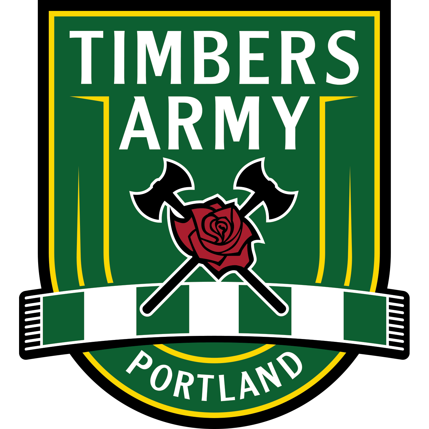
We’re proud and excited to announce a new Timbers Army crest. The new crest celebrates the twentieth anniversary of the Timbers Army, the best supporters the world has ever seen, with a bold, modern design. 

The Timbers Army Crest

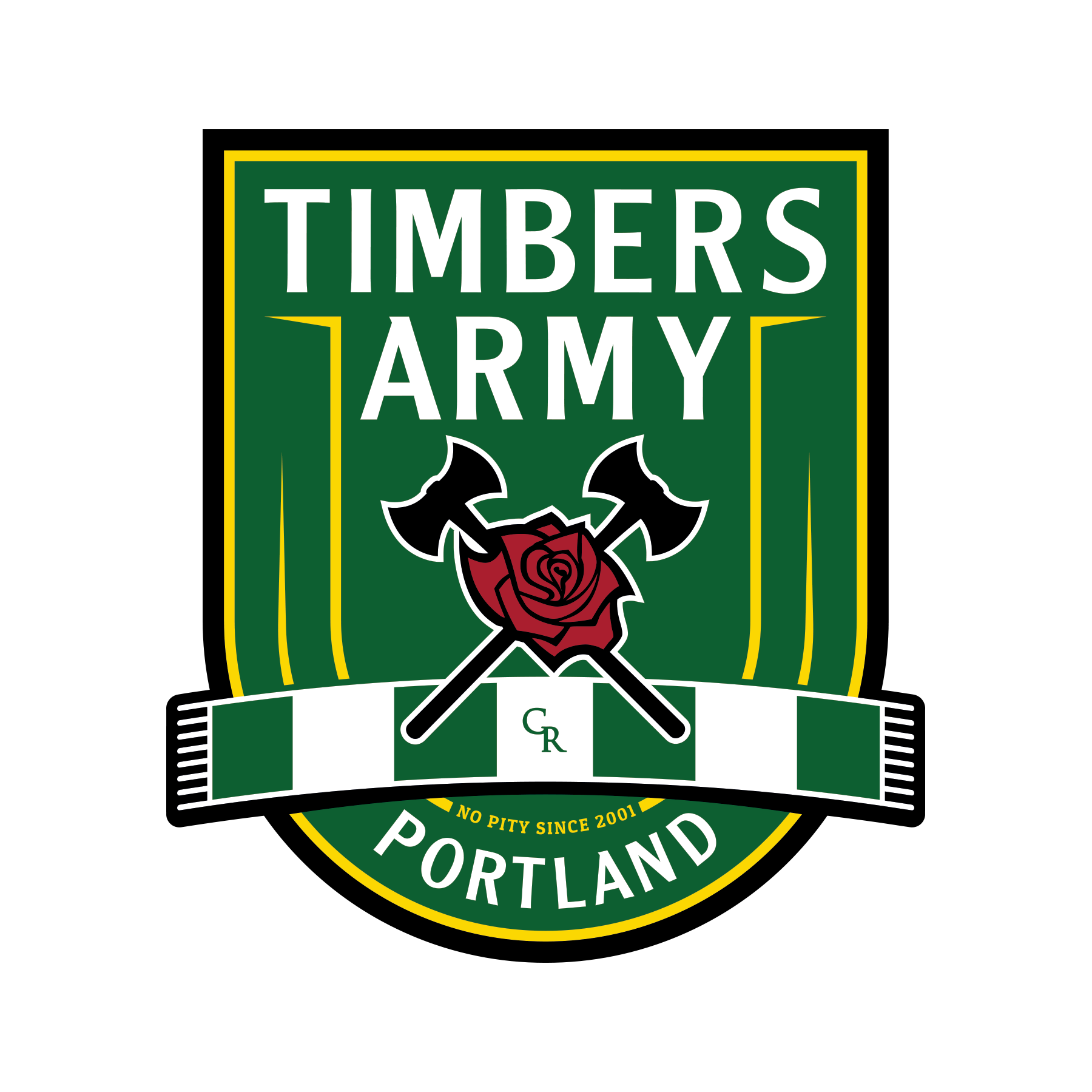
It features the addition of our iconic green and white No Pity bar scarf, the calling card of the Timbers Army since the early days of the group in the Timbers’ USL era. The new crest also carries forward the letters “CR” as a nod to our beginnings as the Cascade Rangers and the crossed axe and rose, which has featured prominently throughout the MLS era. In the full crest, the “No Pity” motto, known the world over, is found nestled in the North End of the stadium, the heartbeat of Soccer City, USA.

2020 Supporters' Player of the Year belt

Over the next few weeks, you’ll start to see the new crest on social media, our website, and No Pity Originals merchandise. New crest merch will be available in the (online-only) winter sale, beginning this weekend!

Read more about our history here.

Comments

  • 11/26/2020 7:18 PM | Pirkko Haavisto
    Why wasn't there a pre-implementation member feedback opportunity, or did I just miss seeing it?
    Link  •  Reply
    • 11/27/2020 7:08 PM | Ina Doerr (Administrator)
      Hi Pirkko, The Timbers Army crest re-design was done by No Pity Originals with feedback given on the re-design from the Timbers Army Steering Committee and the BIPOC Committee. There are sure to be strong feelings about changes to the TA's visual identity, both positive and negative, as well as how the decision was made.
      Link  •  Reply
  • 11/26/2020 7:27 PM | John Acerbi
    I can understand retiring the "Rising Sun" banner, but to purge every remnant of a sunburst? That's ludicrous. Has anyone looked at how ubiquitous that imagery is? The Oregon flag? A can of Two Towns Cider? Etc. What was so broken that required a total redesign that looks like it would be an appropriate sticker on a bunch of bananas? Tweaking a design is one thing, designing while tweaking, is another.
    Link  •  Reply
    • 11/27/2020 7:11 PM | Ina Doerr (Administrator)
      Hi John, There are sure to be strong feelings about changes to the TA's visual identity, both positive and negative. We hope that, over time, this redesign will be embraced by even some of the strongest critics as positive move forward into our future as a supporters group.
      Link  •  Reply
      • 11/28/2020 4:01 PM | John Acerbi
        Sorry, but that response smacks heavily of "tough shit, suck it up" -- Again, what was so broken that required a total redesign? And why was it done without membership input? Extremely disappointing and so 2020.

        Very reminiscent of a certain day in June of 2010

        https://youtu.be/LaVsiCIEMEo
        Link  •  Reply
        • 11/30/2020 5:52 PM | Ina Doerr (Administrator)
          Hi John, the redesign was done by No Pity Originals with feedback from the Timbers Army Steering Committee and the BIPOC Committee. All members of these committees are members of the 107IST.

          NPO received feedback for almost two years about the Timbers Army crest. The designer of the original crest is no longer involved in the organization and simply removing or replacing elements of their original design wasn’t seen as an option. There were many, very serious conversations and the decision was that avoiding rising sun imagery completely was the hard but right decision to make.
          Link  •  Reply
  • 11/28/2020 7:53 PM | John Acerbi
    What's most disturbing about this whole ordeal, is that the new design, which should be representative of the entire membership, was developed, decided upon, fully implemented, THEN sprung on the membership. Not exactly a great example of transparency and outreach there. I have spent many a time defending the decisions of 107IST, even ones I have not been thrilled about, but this is a glaring instance of the sort of complaints about 107IST I've rebuffed in the past. Was it really your intention to alienate as many supporters as possible? If so, this a great leap in that direction.
    Link  •  Reply
  • 11/29/2020 10:05 PM | Steve Kuenzi
    Why didn't you survey the membership for feedback.
    Link  •  Reply
    • 12/03/2020 8:39 AM | Ina Doerr (Administrator)
      Hi Steve, I mentioned this in my response to John already but wanted to address your question, too.

      NPO received feedback about the Timbers Army crest for close to two years. The redesign was done by No Pity Originals with feedback from the Timbers Army Steering Committee and the BIPOC Committee and all of these committee members are members of the 107IST.

      Not all decisions made by the 107IST Board and the Supporters Groups or Committees underneath the 107IST umbrella are put to a vote by members. The Committees involved in the TA crest redesign were aware that the original crest was put to a vote. During the conversations and feedback, these Committees came to the conclusion that avoiding the rising sun imagery completely was a difficult but the right decision to make and that putting its removal to a vote could cause more division amongst our community.
      Link  •  Reply
  • 01/02/2021 12:19 AM | John Acerbi
    So, let me get this straight, because of one element of the original crest, the decision was made to toss the entire design and replace it, rather than remove the offending element? And because the various committees wanted to avoid controversy, it was done without the review and consent of the membership?

    Seems like this is the very lack of communication and openness that breeds the mistrust of the board I hear from so many people. Indeed, very disappointing.
    Link  •  Reply


Powered by Wild Apricot Membership Software