Menu
Log in


New USMNT Jersey

03/23/2011 8:02 PM | 107ist Admin (Administrator)

—by Lucas Grzybowski

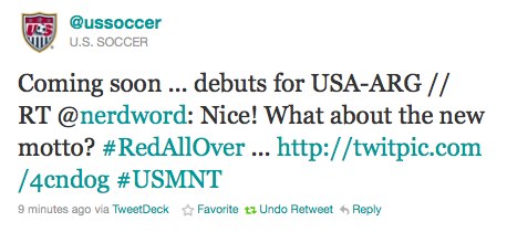
Here it is, as just tweeted by @USSoccer:


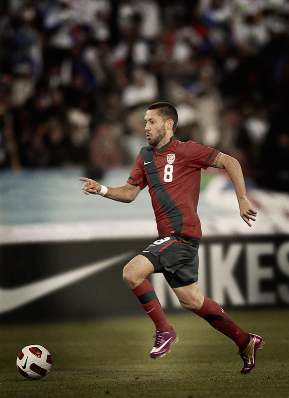
What do we think? As a US supporter and a soccer shirt fetishist (gotta catch 'em all bro!), I love it. The sash design is solid and this color scheme here is much better than the current home shirt with the thrilling light-gray-on-white design (the white-on-navy away kit is nice). I've been wanting them to do a red shirt forever (that Don't Tread On Me shirt from WC06 qualifying was very limited production, just teasing me).

I didn't see any indication of the new "Red All Over" motto they've been talking up, so I asked. And while I was writing this post they retweeted me and now I'm twitter famous! I'm gonna be a millionaire selling pithy tweets! (That's how it works, right?)


Well alright, Saturday is shaping up to be a good soccer day: after the TIMBERS vs Toronto game in the morning (11am, ROOT/FSNW), we've got a choice US match vs Argentina (4pm, ESPN2) complete with new shirts.

(Now if only they'd redesign that badge....)


Comments

  • 07/12/2016 7:54 PM | 107ist Admin (Administrator)
    Eric Maurice says:
    Thursday, March 24, 2011 at 8:08 am

    I’m a sucker for red jerseys so I love the new kit. I think that I may finally break down and buy me some USMNT gear.
    Link  •  Reply
  • 07/12/2016 7:54 PM | 107ist Admin (Administrator)
    Garrett Dittfurth says:
    Thursday, March 24, 2011 at 9:02 am

    I love the new red kits. I will probably by one and just stash it for good measure.
    Link  •  Reply
  • 07/12/2016 7:54 PM | 107ist Admin (Administrator)
    Tye Ortega says:
    Thursday, March 24, 2011 at 11:16 am

    Perfect. Now if only they would just stick with it so the USMNT could have a consistent visual identity.
    Link  •  Reply
  • 07/12/2016 7:55 PM | 107ist Admin (Administrator)
    Lucas Grzybowski says:
    Thursday, March 24, 2011 at 12:44 pm

    @Tye Ortega

    I’d say they have a consistent identity in general: white for primary kit (boring), blue for secondary (less boring but worn much less frequently) and now we have a red third kit (which I would love to see them wear often but which they’ll probably shelve after a few games).

    A new badge would be great. The current one looks like clip art from 1990. To go back to the limited ed red shirts they wore for some of WC06 qualifying, it was basically a throwback to 1950 and had a simple old style badge, and even the Nike “Don’t Tread On Me” badge on the sleeve of that shirt looked better than what they wear currently.

    Shin Guardian has a good post from a few months ago on the crest issue; seems like there’s a huge majority of US supporters who want a new crest. http://theshinguardian.com/2010/12/20/admit-it-the-usmnt-needs-a-new-crest/
    Link  •  Reply
  • 07/12/2016 7:55 PM | 107ist Admin (Administrator)
    Bradley Stonecypher says:
    Sunday, March 27, 2011 at 3:24 pm

    I must say, I love it as well and may just have to break down and by some USMNT gear myself. Now if we can just get a match here – not that it will happen – LOL
    Link  •  Reply
  • 07/12/2016 7:56 PM | 107ist Admin (Administrator)
    # 11 says:
    Monday, March 28, 2011 at 9:47 am

    I really like the deep red.
    It will be great if the red becomes the 1st kit and white away.
    Put the blue in the closet together with the baseball pinstripes kit from 2006-2007.
    Peace out
    # 11
    Link  •  Reply


Powered by Wild Apricot Membership Software